The specific reasons why we find certain photographs more appealing than others can remain somewhat of a mystery to us. While it’s true that we can look at a picture and say “This place looks beautiful” or “I really love the colours in this”, the fact remains that it’s sometimes the careful accumulation of subtleties that make a photograph shout out to our senses.
- Find out How to Pick the Perfect Shutter Speed for Landscape Photography
- Learn about Chromatic Aberration – What it is and How to Avoid it
One of the best and yet often overlooked methods to make your photographs “pop” is by using a strategy called “complementary colours”. Take note...that was COMPLEMENTARY...not COMPLIMENTARY. The difference between the two terms as it relates to colour in photography is that complementary (with an ‘E’) means that one colour works to emphasise the impact of another colour. If a colour is complimentary (with an ‘I’), it just means that green politely mentioned how great red happened to look this morning... which is perfectly fine, too.
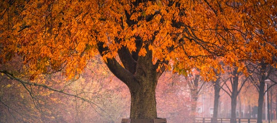
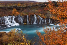
 Complementary colours can make your images stand out. Photo by: 'Adam Welch'.
Today, we’re going to take a closer look at what complementary colours are and how they can be put to use in all aspects of your photography so that your images stand out from the rest.
Colour Theory
Colour theory stretches across all facets of art and photography. While the exact applications are wholly different, the overall intention remains the same – that is, to impart a certain experience to our viewers. As simple as it might seem, colour is an extraordinarily complex mechanism. Luckily, our good friend and renowned mathematician, Sir Issac Newton, gave us a little help when he developed the colour wheel in the early 1700’s.
 The colour wheel. Photo by: 'J. Arthur H. Hatt, Wikimedia Commons'.
Artists such as painters and other more tactile-based creators might look at the colour wheel differently than photographers and for entirely separate purposes. That being said, many of the concepts of colour theory can be exercised in most of the situations we are likely to encounter as photo makers.
Of course, black and white and monochromatic photography, even though more heavily anchored in the world of colour than one might first assume, don't benefit from the use of complementary colours and basic colour theory. However, our full colour photos can gain much from even the most rudimentary application of artist colour theory. It all goes back to Newton and his wheel.
Understanding the Colour Wheel
The colour wheel gives us an easy way to determine how certain colours interact with one another as well as serving as a reference point for complementary colours examples.
The colour wheel is based on three 'primary' colours: red, blue and yellow. Between these, we have their blends, such as green, purple and orange; these are known as 'secondary' colours.
Digging deeper, the colours which lie between the secondary colours of the wheel are called 'tertiary' colours. These are our blue-greens, red-oranges and yellow-greens. It might be better to think of all colours which aren’t primary colours more or less as transition zones. So really, the entire colour wheel might look more like this.
 The Colour Wheel. Photo by: Photo by: 'Adam Welch'.
For our purposes, we will merely need to understand the basics of opposite colour tones. Complementary colours can be used in your photography by surveying the available colours in your scene and then applying the knowledge of the colour wheel in order to best present those colours within your photo. Even non-primary colours can be put to work to operate as colour opposites to help your photography.
How Do Complementary Colours Work?
Before we really get going, let’s first make a note that this article is not a scientific work and that entire books can and have been written attempting to better describe the relationships of colour and art. So remember, even though you’re about to learn all about the ways complementary colours function in photography, we are only scratching the surface of the entire concept of colour theory.
Complementary Colour Pairs
At their most basic core, complementary colours are colours which lie directly opposite of one another on our trusty colour wheel. More impactful colour in photography can instantly be achieved simply by looking for ways to incorporate these “colour opposites” in your images.
In essence, complementary colours aid in producing more engrossing contrasts between colours.
Examples of Complementary Colours
Red and green, blue and orange, yellow and purple; these are true complementary colours and as I’ve named them off, you might possibly have recalled seeing these colours mated together in the past.
This is the reason why those gorgeous photos made during the transition between blue and golden hour look so amazingly beautiful. It’s why fields of certain wildflowers seem to be so inexplicably attractive. Under the right circumstances, even complementary colours in portrait photography can wow us.
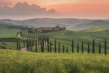
Simply put, with the right kind of creative eye, using complementary colours in your photographic work can make the ordinary seem a little more extraordinary. Here are a couple quick examples of complementary colours... just because.
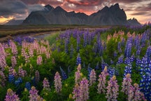
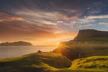
 An example of complementary colours during the night. Photo by: 'Adam Welch'.
 An example of complementary colours with a wall and a door. Photo by: 'Adam Welch'.
How to Master Complementary Colours
Up until now, we’ve talked about complementary colours as they relate to the colour wheel and colour theory. For the rest of this article, we’re going to switch gears a bit and discuss how you can actually put complementary colours to work for you when it counts; out in the real world with your camera.
The fun doesn’t stop there (at least I think it’s fun) because after that, we’re going to move into Lightroom to have a look at a couple of post processing tips that you’ll need to know so you can make the best use of complementary colours within your own images. Spoiler alert... I’m going to show you how to “cheat” just a little bit when working with colours.
Situational Awareness
In photography, a great deal of the creative battle is won by simply being conscious of yourself and your surroundings. To quote the great Ansel Adams, “A good photograph is knowing where to stand.”
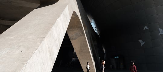
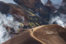
 Mastering complementary colours isn't all that hard. Photo by: 'Adam Welch'.
The reality is that one of the most difficult aspects of any type of photo work is figuring out where and what to photograph. In short, you must be completely awake to your surroundings at all times and this is especially true when it comes to incorporating complementary or any type of analogous colour photography into your shooting.
Always keep in mind that you will have to work at becoming more observant to the availability of complementary colour tones even if the colours aren’t exactly complementary. While it goes without saying that our eyes are extraordinary mechanisms, we have to remember that it is our brain that actually does the seeing by interpreting the presented information. So, depending on the information, our brains will process the appearance of colours differently when faced with varying situations.
A quick side note: the brain named itself. Think about that for a while.
- See also: The Orton Effect Explained
Light and Colour Temperature
We all know that light is what makes photography possible but have you ever thought about how light can affect colour?
When you are considering using complementary colours, be mindful that light will play a key factor in the fluidity of colour tone; meaning certain colours might appear differently as the light changes. This refers back to when we briefly mentioned the way the golden and blue hours seem to be such magical times for photography. One of the reasons for this is due to the transformative effect the available light during those hours has on colour temperature. Even night photography can present great opportunities to incorporate complementary colours into your work.
 Colour temperature affects colour tone. Photo by: 'Adam Welch'.
To keep it simple, colour temperature can help you immensely when working with colour tone in your photography. An orange or yellow building that seems to be without contrast and flat in the drab mid-day sun might spring to life in the morning or evening blue hours.
The same is true for the opposite, as hues of blues and purples will absolutely begin to pop during golden hour. Again, be aware and mindful of the environment around you and pay close attention to how the available light might transform those surroundings into something more appealing.
As I mentioned earlier, there are ways to cheat when it comes to complementary colours. Well, maybe not exactly cheat, but there are certainly ways with which we can make colours “more flexible” during post processing. Buckle in for the next section, where we’ll talk about one of the most under-used yet never over-appreciated tools in Lightroom for working with colours.
- See also: Bright Ideas for Shooting in Daylight
The HSL Panel: Colour and Glory
If you’ve never used the HSL panel in Lightroom before then hang on, because I’m about to literally change your life. Even if you’re not working directly towards tailoring your complementary colours, the HSL panel is an absolute powerhouse for working with colour and mastering black and white conversions. But I digress.
HSL stands for Hue, Luminance and Saturation. We can use the HSL panel to control the brightness and tonal properties of individual colours within our images. As you might have guessed, this is a huge benefit for us when working with complementary colours.
 The magnificent HSL panel in Lightroom CC. Photo by: 'Adam Welch'.
Using HSL, we can help nudge colours which aren’t precisely complementary to each other closer to being so. We can also use it to saturate (or desaturate) some colours selectively in order to make other colours stand out more within the composition.
Remember that image of the blue door from earlier??? Well, this is what it looked like originally...
 The orange wall was originally yellow! Photo by: 'Adam Welch'.
Below is what it looked like after adjustments. Quite a difference, no?
All I have done is adjust the hue, saturations and brightness of the yellow and blue colour tones within the photo using the HSL panel. Here’s a before and after to really show the difference.
 Before and after. Photo by: 'Adam Welch'.
Keep in mind that we did all of this with just a few simple slider adjustments inside the HSL panel. For complementary colours, the HSL panel is nearly indispensable and if you’ve never used it before, you might begin to wonder how you ever lived without it in the first place.
Let’s Sum Up…
Strong photography is all about paying attention to details and looking for ways to present a person, place or thing in a way that will cause the viewer to look a little deeper. As photographers, it's our job to interpret the world around us using our cameras and our ability to creatively incorporate all the tools at our disposal and one of the greatest tools we have is the power of colour.
Using the principles of colour theory, more specifically complementary colours, allows us to make our photos more appealing by simply knowing how to make best use of the colours which surround us. Here’s a round up of all the things we’ve discussed today that will help you put complementary colours to work so you can make better and more powerful colour photos:
-
Complementary colours add an interesting aesthetic contrast to your photos.
-
Complementary colours are found opposite of each other on the colour wheel.
-
The colour wheel is your friend. Use it as a reference for the way colours relate to one another and apply it to your photography.
-
Be aware of your surroundings and consciously look for the dynamic tonal interactions between colours.
-
Remember that the time of day you shoot plays a key role in the colour temperature of light which directly affects colour hue and saturation.
-
The brain named itself...still bothers me.
-
Make use of the HSL to adjust and channel the power of individual colour tones in your photos.
Congratulations! You’re now fully prepared to go out and make better use of complementary colours in your photography. As always, have fun and happy shooting!
About the author: Adam Welch is an adventurer, photographer and author based in the USA. You can find more of his work on his website or by following him on Facebook and YouTube.
Practice colour theory by using complementary colours with your photography in-field! Join us on a 5-Day Summer Photo Tour. Our expert photography guides will make sure that you're in all of the right places at the right times to take advantage of the best conditions and light.