As a photographer today in the digital world, you absolutely must have some post processing skills. The first step of a photographer is going out into the field to take your photos. You go to a location, select compositions, wait for that beautiful light, and execute your creative vision through the lens. However, it doesn’t stop there. Taking photos is only part of the process. When you get back home and load those new images to your computer, they need to be run through image editing software (or post processing software) to achieve that vision you had in your head.
- Learn How to Choose Which Version of Lightroom to Buy
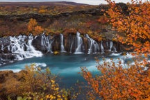
- Check out these Private Tours in Iceland
- Join us on this 12 Day Greenland Photo Expedition
Adobe’s Lightroom CC is the top image editing program out there today. With Lightroom, you can adjust your exposure, your levels, curves, perspective, aesthetic effects, and colour. There are many tutorials on these things but today, we are focusing on colour.
Colour is vital to a photograph, not only because a pop of colour can attract the eye but because it can help express mood and convey your individual vision. In Lightroom, the colour of an image is controlled in what is known as the "HSL panel". In this article, we are going to teach you all about the HSL panel and how to use it.
What Does HSL Mean?
What is the HSL panel in Lightroom CC? First, let’s answer what HSL means.
HSL stands for Hue, Saturation, and Luminance. These three values are the basis of colour. Every colour you can imagine has a value of hue, a value of saturation, and a value of luminance. Lightroom has created a panel in its software dedicated to adjusting these values individually, so that you can create or adjust any colour in the most precise fashion, giving you total creative control over your image’s colours.
Those of you who are new to colour theory are probably thinking, “Umm, isn’t colour just a colour? Like blue is blue, red is red, green is green?” The simple answer is yes, but it’s so much more complicated than that.
Hue
First, let’s discuss “hue”. The scientific definition of hue is “the attribute of a colour by virtue of which it is discernible as red, green, etc., and which is dependent on its dominant wavelength and independent of intensity or lightness”.
Now that we have got that out of the way, let’s just think about a specific colour. Blue. The sky is blue. The ocean is also blue. However, are they the same blue? No. Depending on where in the world you are, the ocean may be more of a blue-green colour. Other oceans may look like such a deep shade of blue that it almost looks purple.
Another great example are autumn leaves on a tree. Some leaves are bright yellow, some are a basic yellow, then the leaf next to it may be a more orange-yellow, and another may be a slightly greenish yellow. They are all yellow but different shades of yellow. This is the hue of the colour. It refers to the varying shade of a specific colour. In the hue chart below, you can see various shades of red, blue, and yellow.
 Hue chart of the various shades of red, blue and yellow. Photo by: 'Sean Ensch'.
Saturation
Next, we have the “saturation” of a colour. Saturation refers to the intensity (or purity) of a colour’s hue – in simple terms, how strong that specific colour is.
For example, let’s take a look at a basic red. At full saturation, the red is a deep, bright red. When you begin to remove saturation from the red, it becomes more and more dull until all the colour’s intensity is removed and you are left with a colourless grey.
Below is a chart to show levels of saturation in red, blue, and yellow. At the far left, you have 100% saturation (a pure colour) and as you progress to the right, I have decreased saturation levels by 10% until we are left with grey (no saturation).
 Levels of saturation in red, blue and yellow. Photo by: 'Sean Ensch'.
Luminance
Lastly, we have “luminance”. Luminance is fairly easy to understand. It refers to the brightness level of a specific colour.
A great way to visualise the luminance values of your colour is to convert an image to black and white or monochrome. Once the image is in black and white, you can see the luminance of your colours. This is what makes luminance the most powerful value to control for in black and white images. You can adjust the brightness of the image, based on the specific colours, instead of brightening it overall.
In the image below, almost all the colours are a shade of blue. In the black and white version, you can see how the luminance of the colours varies.
 Luminance of the colour blue in both a colour and black and white image. Photo by: 'Sean Ensch'.
- See also: Ultimate Guide to Luminar by Skylum
How To Adjust the HSL
Now let’s get into the fun part as we demonstrate how to use the HSL panel. If you’re brand new to Lightroom, you may be wondering “where is the HSL panel in Lightroom?” or what to do if your Lightroom HSL panel is missing. Don’t stress! Lightroom has made using the panels very easy.
When you have your Lightroom library open, go in to the develop module by pressing “D” or clicking on Develop in the top right.
 Click on 'Develop' on the top right. Photo by: 'Sean Ensch'.
When you’re in the develop module, all your editing panels will appear on the right column. Find the HSL panel and open it up.
 Find the HSL panel and open it up. Photo by: 'Sean Ensch'.
With the HSL panel opened, you can see along the top that there are buttons for “Hue, Saturation, Luminance, All” with a list of colours below. Each colour has its own slider, which will allow you to adjust each colour independently.
If you click Hue, you will open the Hue panel to adjust hue values of each colour.
Clicking on Saturation opens the saturation values, and clicking Luminance opens the luminance values.
If you press “All”, you will have a panel that has all values listed at once. Some find this useful by being able to view all values at once. I prefer to keep it clean and tidy by only having one open at a time. It’s all personal preference.
 This is the HSL panel. Photo by: 'Sean Ensch'.
First, let’s work in Hue. Below, I have an example image of a beautiful spot in the Arizona desert. The rock formations are a deep red with coral pink sand, there is a little spot of yellow green grass and a blue sky beyond.
To use the Hue panel, you simply select which colour you would like to adjust and move its slider either to the right or left. This will shift the hue of the colour. The further you move the slider from the middle, the more the shift in hue. As an example, I have shifted the blue hues to the left by -80. You can see how this changes all the blues into an intense aqua colour.
 The blues have been changed to an intense aqua colour. Photo by: 'Sean Ensch'.
It’s that easy. Now I don’t really want my image to look like that, so let’s follow the workflow of what I would do to the HSL panel for this image. In the image, the red rocks have a slightly more orange-red hue to them due to the warm, diffused afternoon sun. As such, I want to adjust the red hue a bit to a cooler red. Moving the Red’s slider to the left -70, my red colour gets a bit cooler to where I want. I then adjust the yellows +50 in the grass to a more greenish yellow, so it will stand out a little more. Last, I adjust the blues -20 to take a little of the purple-blue look to the sky. These subtle adjustments to the hues balance the colours exactly where I want them.
 Subtle adjustments can balance the hues exactly how you want them. Photo by: 'Sean Ensch'.
Now let’s jump over the Saturation sliders. As we discussed, this will adjust the intensity of the colours. The reds and oranges in the rocks and sand look a little washed out and I’d really like to accentuate those, so I added +55 to reds and +35 to orange.
Next, I wanted the greens and yellows of the little grass patch to pop out a little more against the sand, so I added +70 to yellows and +65 to greens.
Last, the blue in the sky is a little too strong against the other colours, so I would like the sky to look a little more soft. By taking the saturation down -20, it takes that extra punch out of the blue.
 Taking the saturation down can make the sky look more natural. Photo by: 'Sean Ensch'.
Luminance is the last adjustment that we can do with the HSL panel. Increasing the luminance by moving to the right on the slider to the right on the slider will brighten the colour, while decreasing (moving to the left) will darken the colour.
First, I want to show you just how luminance can affect the image. Let’s use the blues for an example again. Below, you can see what happens when I drop the luminance of blue down -100. You can see the sky turn in to this deep, dark blue, getting closer to black.
 Decreasing the luminance makes the sky appear deeper and darker. Photo by: 'Sean Ensch'.
For our image in particular, the luminance adjustments I used were -22 to red, +80 to yellow, and +10 to blues. Lowering the luminance of red made the rock’s colour a deeper red. The +80 increase to the yellows helped lighten the little grass patch so it popped even more against the sand. Lastly, I added a little brightness to the blues so the sky would soften just a touch more.
 Adding brightness to the blues in the sky allowed me to soften it a little more. Photo by: 'Sean Ensch'.
Below you can see the before and after. A great change using only the HSL panel.
 Before and after HSL adjustments. Photo by: 'Sean Ensch'.
HSL With Black and White Images
Black and white with the HSL panel? It seems like that wouldn’t make any sense. However, if you shoot in RAW format, all the colour information is still stored in Lightroom even after you have converted to black and white. It becomes a control of luminance at that point.
Let’s see how luminance can affect your black and white images. First, let’s convert our image to black and white. You can do this by opening the “Basic” panel and in the top right corner, you will see Colour (highlighted if you’re in colour) and “Black & White” next to it. Select Black and White and your image is converted to monochrome. Don’t worry, if you want to go back to colour, you can just click 'colour' again and it brings your image back to colour.
While you’re in black and white, you’ll notice that the HSL panel has disappeared and been replaced with the “B&W” panel.
 HSL can also be adjusted in black and white images. Photo by: 'Sean Ensch'.
Open your B&W panel and you’ll see you have your colour list along with a set of sliders. Now, since your colour information is saved in your image’s RAW format, you can adjust the colour’s luminance with these sliders.
Remember how luminance affects the colour’s brightness/darkness? Now that you've converted the image into monochrome, you can adjust the luminance of specific colours with these sliders while in black and white. This gives a lot of editing power for black and white images because you can make finely-tuned adjustments to brightness and contrast levels based off the colours, rather than adjusting the overall brightness and contrast of the image. By deepening the reds and blues and increasing the yellows, I achieved a lot of dark contrast in this black and white image.
 Adjusting HSL with black and whites images allows you to control the contrast. Photo by: 'Sean Ensch'.
Conclusion
As you can see, the values of hue, saturation, and luminance can greatly enhance your work as a photographer. Even small adjustments to an image’s overall look can change the entire feeling. Changing the hue can make your image’s feel surreal and fantasy-like or just simply correct colour to be more natural. Saturation changes can greatly affect the mood of an image. Bright saturated colours that pop often convey a feeling of happiness, fun, excitement, or intensity. On the contrast, desaturating colours can give a sombre feeling of sadness, darkness and foreboding. Adjusting luminance can give your black and white images amazing depth and contrast without even touching the actual exposure. Learning how to understand and use the HSL panel gives you the creative control over colour that you need to produce images with the exact look and expression that you envision.
About the author: Sean Ensch is a landscape photographer based in the USA. You can find more of his work on his website or by following him on Facebook and Instagram.
Do you use the HSL panel when editing your images? How has it helped you to achieve your own style? Leave a comment and share your thoughts below!