Almost all new photographers list getting better at composition as something that they struggle with. That makes a lot of sense and unfortunately, composition is one of the most difficult things to learn. If you think about it, composition is a very personal relationship between the photographer and the subject. Composition is how a photographer puts his or her own spin on a photograph.
- Explore these articles on Photography Techniques
- Discover these 5 Composition Techniques That Will Improve Your Landscape Photography
How do you teach someone “creative vision?” The goal of teaching composition is not to make a bunch of clones of the instructors’ photographic style, but to help people develop their own ways to see the world. I’ve spent a lot of time thinking how I arrived at my own methods of composing images and these are a few tips I think can help anyone improve their compositional skillset.
What is Composition?
Put simply, composition is how the elements of a photo are arranged. A composition can me made up of many different elements, or only a few. It's how the artist puts those things within a frame that help a photograph become more or less interesting to the viewer.
A good photograph will take many different parts and combine them into an aesthetically pleasing whole. Composition is how an artist tells a story within the confines of a single frame.
Why is Composition Important in Photography?
How many times have you seen a photograph that seemed to be taken in an amazing location with an incredible subject, but the image didn't do much for you? The problem very well might be that the composition was off.
Composition is everything when it comes to a photograph. Oftentimes, the technical side of an image is pretty easy to learn, so the one thing that separates a great image from one that is less interesting is the composition.
Everyone has a camera these days, so how you are able to visually capture something that is also being photographed by the masses right alongside you will help to distinguish your work from other photographers. Hopefully, this will gain you the success or business you seek.
Composition Concepts and Principles
I would be willing to bet that a large majority of digital photographers don’t know these… and yet each of these principles and elements can be something to look for which will help you to find something interesting to photograph. I’ll address a few of these in more depth below. In addition to being something that can be the primary compositional element of a photograph, each of these can be combined with other compositional elements to make for more aesthetically pleasing images.
Elements of Composition
Lines
When it comes to bringing attention to specific parts of a frame, lines are one of the best ways to do so. What better way than a nice, strong line pointing RIGHT at the subject to catch the viewer's eye?
Leading lines are just that – lines that point you into the frame, towards the subject. In addition to lines that lead in to a composition, you can have multiple lines that converge into the frame, or towards the subject.
When it comes to my lines, I try whenever possible to bring them in from the corners. The corners are neutral and these “leading lines” don’t cut part of the frame the way a hard line from an edge will. Rivers and streams are great ways to incorporate leading lines, movement, and colour into an image. “Converging lines” can be the edges from numerous buildings or trees, or any group of edges pointing towards the middle of the frame from all sides.
 Converging lines can be anything. Here a group of seals all point towards the subject in the middle. Photo by: 'Brian Rueb'.
Shape and Form
Shape and form are similar elements of design – the main difference being that things with form are three dimensional, having height, width and depth.
Photography is a 3D representation of a scene, so whereas a painting might have more shapes in it, a photograph typically has more forms. The more interesting the form, the more interesting the image. Forms can be geometric like a building or organic, like a walrus or a person.
Value
Value refers to how light or dark something is in a photograph. It refers to the shades of white, black, and grey.
The beauty of photography is that you can use black and white shades to create powerful images. Oftentimes, photographers who are looking for vibrant colours or other dynamic aspects in a scene will forget to notice how many different tones lie within a potential frame.
Space
The way you put forms and shapes together occupies space within a frame. This arrangement is the composition and also leaves empty or “negative space” around and between other forms. This negative space can become an interesting compositional element as well.
When you’re looking for a shot, especially in urban areas or with portrait work, not only are the forms within the frame important but the space that isn’t occupied by these forms can be just as poignant. Keep in mind that when using silhouettes, these “forms” can look more like shapes and playing with them to make things look two dimensional can also be a powerful tool in photography composition.
Colour
Part of learning about photography is studying colour. Colour is comprised of three parts: hue, value, and intensity.
Those who use Adobe products will no doubt recognise that the 'hue' is simply the name of the colour (e.g. red, blue, green, etc). The 'intensity' refers to saturation (how bright and pure the colour is), while the 'value' refers to luminosity (how bright or dark the colour is).
There are some basic colour schemes that work well together. They’re practiced daily by artists, graphic designers and other photographers. These simple colour theories can really help when you are looking for compositions that will work. Remember to look at a colour wheel from time to time. Study the different colour theories. Complementary colours, analogous colours... even primary, secondary, and tertiary colour schemes, as well as monochromatic other than black and white.
 The complementary colour scheme works here with blue and orange. Photo by: 'Brian Rueb'.
If you head to color.adobe.com then you will find some really great ways to check different colour schemes. This app will also show you other colours that work well with a dominant colour in your photograph. This might help on the backend as you process an image, when you want to process a certain colour a little warmer or cooler to help fit in with a predetermined aesthetic.
Texture
Texture refers to the tactile element of something. In the case of a photograph, there isn't any one tactile feeling. All photos feel the same. As such, the texture refers to the look of how something is perceived to feel, in reality.
If you’re taking a photo of a cactus, there’s a texture there that gives the viewer an idea of what that cactus FEELS like. Compositionally, making texture a big part of a frame can really give the viewer a sense of a place.
Principles of Composition
Rhythm
Rhythm creates movement by repeating patterns and shapes throughout the frame of an image in random or highly organised arrangement.
Balance
I always refer to balance as a 'teeter-totter'. If you split your composition in to halves (top and bottom or left and right), does it feel like they belong together? Does one side feel like it has too much going on? This doesn’t mean that both sides have to be symmetrical… but if you have an object on one side that attracts the viewer's eye, the other side should have something to keep you interested in the whole image as opposed to just the dominant or larger object.
 Balance within a frame helps. In this case the dark trees balance well with the white of the waterfall. The fog was accentuated slightly in post-processing to help create unity. Photo by: 'Brian Rueb'.
Unbalanced images can hold the viewer's eye on one side of the frame instead of allowing it to take in and flow through the whole composition.
Proportion
Proportion refers to the size of objects within a frame as they relate to one another. It can be utilised within a successful composition by exaggerating proportions in one way or another by changing the camera angle.
The photographer can also position the subjects in such a way to make the differences in proportion the focus of the image.
Emphasis
Emphasis refers to how the elements of your composition guide the viewer to an intentional subject within the frame. To do this, the photographer can employ a variety of techniques.
Playing with selective lighting helps to emphasise the subjects being lit. Other ways to emphasise a subject include leading lines and proportion. Even the way that the photographer dresses or groups subjects can place emphasis within a frame.
Harmony
Harmony uses colour, texture, line and other aspects of art to point out the similarities of subjects within an image. Harmonious images will often showcase how different objects are all the same, and utilise something that all the objects have in common to do so.
Variety
Variety is the opposite of harmony. Not to say that it is chaos, but variety juxtaposes different objects together so that their differences are what brings interest to the photograph and the story being told.
Movement
Movement within a composition is the photographer’s ability to imply motion. Obviously, nothing within a still image is actually moving, but by the use of creative shutter speeds, panning or zooming with the camera, you can create an implied feeling of motion.
Gestalt Principles of Composition
Similarity
Showcasing how things are alike can be a powerful tool within a composition. This can be done by grouping things with likeness together, such as texture, shape, colour, value or size.
The viewer is often looking for a sense of unity within an image, so putting many things together that share common traits can help convey that satisfaction.
Continuity
Continuity refers to how the shapes and lines within your image work together to lead from one to the other. The end of one shape should lead directly into the next shape or shapes.
The word that I like to use to describe this is ‘Flow’. Essentially, continuity describes how the objects within your composition flow from one position to the next.
Closure
Closure is a difficult principle of composition to realise in photography, but the way that a composition is laid out can make the viewer see a more complete picture.
A good example may be when you are photographing a large crowd of people who are mostly all wearing similar attire. Within that group, there may be several people not wearing the same attire… but the perception at first is that the entirety of the group is all the same.
Proximity
When you put things together within an image, they will appear to be part of a greater whole or group. An example is when you are photographing something using a telephoto lens. In doing so, you are able to compress the scene to make all parts of the frame appear closer in proximity. Two separate mountain ranges can look like they are part of the same mountain range, when in fact there may be hundreds of miles separating them.
Figure / Ground
Figure / Ground refers to the relationship between the main object and everything else in the frame. Typically, these objects may be people, wildlife or a product. Traditionally, the goal of the photographer is to put these subjects in a place where they clearly become the dominant part of an image and stand out from the background.
In portrait, wildlife and product photography, the approach of blurring those lines or camouflaging the separation between figure and ground is often achieved by using depth of field or bokeh. In landscape photography, the approach is quite different, in that most people often seek front-to-back sharpness from the foreground to the background of an image.
Symmetry
Oh, how we love order. Have you ever seen a composition that had a reflection or a really nice pattern in it, but the photographer cut off a portion of the reflection or didn’t line up the pattern correctly? These type of images are a little unnerving.
When you have scenes that have the potential to be very symmetrically aligned, it’s important to make them line up. If you cannot do this in the field, then giving yourself room to do it in post-processing can work just as well.
If you’re going to go against symmetry, it’s important to go over the top so the viewer knows that you did it on purpose. When the symmetry is off by just a little bit, it can make your composition look lazily constructed.
Tips for Finding the Right Composition
#1. Inspiration and Learning to See
Photography may have been your first creative outlet but artistic vision takes time to develop and it doesn’t usually begin right when you pick up a camera.
For me, I was an art major in college, and my exposure to the arts began when I was very little. I was interested in painting and drawing throughout my life. As a result, I was exposed to a variety of different art mediums, artists and their works. None of this was directly related to photography, yet it all helped to shape the way I see. As such, I encourage photographers to look at other forms of art.
Take a painting class at a local gallery, or college. Learn how to create and to be creative with different mediums.Look at classical paintings and try to envision what the environment looked like when the artist created that painting. How would you compose something similar with a camera? How did they use light? Even though the people in the paintings might be centuries old, what ideas can you incorporate from the work into your current photo shoot? What times of day have you seen lighting that is similar? Which locations have you visited that remind you of that particular place?
You can even find inspiration in abstract or impressionist painters as well. Look at the work of painters like Richard Diebenkorn and Jackson Pollack… I bet you can start to see things in nature or man-made subjects that might look similar. What about if you shoot aerial photography with a drone?
I constantly see things that remind me of a certain painting or painter. Once I see these, I am able to start envisioning how I will compose them so that they look like the style of that painting.
My advice is that you look at more artwork outside of photography… it will help you with your compositions.
#2. Do Your Research and Plan Your Shoot
The more I photograph, the more I enjoy the spontaneity of just showing up somewhere and making the most out of whatever shooting situations present themselves. However, there is something to be said for having at least a little idea of what you’re trying to accomplish when you head out.
During a recent trip to Scotland, we set off to photograph a scenic vista that we hadn’t researched very well. What we thought was an easy mile and a half hike ended up taking us 30-45 minutes, with much of it being a steep uphill slog. Needless to say, we missed a nice sunset as we were sweating and heaving somewhere below the summit.
A little more research on my part would’ve allowed me to plan for the appropriate time that it would take to hike to the top and I could have possibly created much better images if I had the time to find the best compositions.
With portrait shoots, it’s important to know what kind of location you will be bringing clients into before you photograph them, so that you'll know where you need to place them to get the perfect shot. The last thing that you want is to be looking for the best spot to shoot when your client is ready to have their picture taken. This can be a waste of time and result in you losing the best light. Planning can help save a lot of preventable headaches later.
#3. Arrive Early
As I mentioned, I’m becoming a fan of “finding” the shot once I arrive somewhere. I love looking for that different angle or unique perspective. For me, the hunt is almost as fun as the final product. Knowing that this is part of how I compose my shots, I NEED to arrive with plenty of time to explore.
Whether you’re shooting a portrait, a social event, wildlife or landscape, having a good idea of current conditions and possibilities will help you to react better when the shooting starts. So always plan to arrive at your destination ahead of time.
Composition Techniques
Selective Focus
If you or I were sharing a scene with Brad Pitt, it would be hard to showcase us with him being on screen too, unless we did something to really put the emphasis on ourselves!
Selective focus is a great way to have something iconic in your frame with something that is less iconic in the background. By putting one subject in focus and having the other blurry, you can place importance on one subject more than the other. This is usually done by experimenting with depth of field and can really help make a composition more concise and interesting.
Needless to say, this technique is great for wildlife and portrait photography. When you have a single point of focus where the image has one main subject and everything else is very subdued, it can guide the viewer's eye straight into your composition.
Simplicity
When you are overwhelmed by a grand scene and there is too much going on, try to ask yourself, “what do I find the MOST interesting here?” Then make the entire image about that.
Keep it simple… show the viewer JUST the thing you want. Not every image has to have a killer foreground with three or four subjects leading into an amazing sky in order to keep your viewer interested.
Rules and Ratios
In photography, there are a lot of “golden” rules and ratios that can be used to help highlight points of interest in your composition. These ratios divide the frame into the key areas by using lines and curves where your eye is naturally more likely to go.
The point of these ratios is to help you to place elements within a composition where the eye of the viewer is most likely to gravitate, as well as to put subjects in angles and positions where they may help to draw the eye around the frame.
Lightroom and Photoshop both have overlays for all of the different ratios that I will mention below, so you can see how your photos line up with them.
Rule of Thirds
The Rule of Thirds uses key intersection points and breaks the scene up into thirds vertically and horizontally. In the grid where these lines intersect are the points where you should try to put your main subjects.
- See also: Rule of Thirds Explained
Golden Spiral
The golden spiral is another method that people often use to compose a shot. A curve starts from the corners and goes across the upper portion of the frame, spiralling towards the middle and the bottom. The concept is that movement and subjects should all fall on the curve and your most interesting portion of the frame should align closely with the middle of the spiral in the lower quadrant of the frame.
 The golden ratio works here, and the spiral ends where the little lighthouse is situated. Photo by: 'Brian Rueb'.
Golden Triangles
Golden Triangles are yet another composition technique that photographers use to break the scene up and put emphasis on certain areas of the frame. This involves drawing a diagonal line from one corner to the other of the image, and then from that line, two more lines come from the remaining corners to connect them together. Where the shorter lines touch the larger middle line are the areas where the most interesting parts of your composition should be lined up.
Baroque and Sinister Diagonals
If you’re a real art history buff, then you've probably heard about the Baroque and Sinister Diagonals.
Baroque diagonals are lines going from right to left across the corner. The Sinister Diagonal goes from left to right across the corners. It would be simpler to just call it an ‘X’ across the frame, but that’s not as cool.
Shorter lines branch off this ‘X’ to give more points of interest.
 This image of a grizzly bear is a great example of how the baroque diagonals work within a frame. Also, again keeping the subject looking within the frame. Photo by: 'Brian Rueb'.
Reflections and Dynamic Foreground
Two of my favourite things to look for when composing a shot are reflections and a dynamic foreground. I’ll look for water anywhere to use in an image. Reflections not only capture an additional image of the main subject (and what’s better than one dynamic subject? TWO of them!), but water will also hold any colour from the sky, giving you all kinds of added excitement to an image.
When there isn’t any water, I’ll look for other kinds of dynamic foregrounds, such as old tree stumps, beds of wildflowers, interesting foliage, cracked earth... anything that will fill the foreground within my frame and help me to add interest to the overall scene. What's even better is if the foreground contains lines that will lead towards my subject.
While these types of foreground are associated mostly with landscape photography, with a little creativity, they can be great in urban, wedding and portrait work as well. For portrait and product work, foregrounds don’t have to be as dynamic but take care to eliminate any distractions that may draw attention away from your main subject.
 This reflection image shows how just a reflection can be its own powerful composition. Using complementary colour scheme and the framing of the foreground ice also helps this composition. Photo by: 'Brian Rueb'.
Contrast
People usually think of a balance between light and dark when they think of contrast. While that’s certainly something useful to have in your pocket when composing an image, think of other ways that things can contrast and look for those as well.
There can be contrast in the form of big and small, old and new, alive and dead, hot and cold, fast and slow. There are so many different ways to tell a story with contrasting elements other than light and dark. Look at your subject, find things that contrast with it and try to use them as a part of your composition.
Repetition of Shape
Patterns and repeated shapes are an amazing way to make interesting photos. The key is to really fit them in the frame well (fill the frame!) and make sure there are other interesting things at play besides the pattern, such as colours, textures and contrast.
 Repetition of shape, and the continuity help to make this image work well. Photo by: 'Brian Rueb'.
Perspective
Tunnel vision for photographers is very real, especially when there’s something awesome going on. I really try to push my workshop clients to keep moving and not settle for 500 shots of the same composition.
Even though you may have found the perfect angle for your shot, you need to see what other options are around. You can always come back and take that iconic shot again when the lighting changes. In the meantime, experiment by getting higher, getting lower, even laying down! Change the angle of your camera so that you get a different perspective of the scene.
Focused Light
Almost anytime that the sky opens up and gives you wonderful rays of light, an interesting shot is just waiting to be captured. Focused light automatically gives you a point of interest due to the contrast it creates between light and dark areas within a scene.
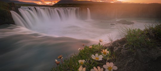
 Focused light in the form of a rainbow helps push the viewer into the frame. Photo by: 'Brian Rueb'.
Natural Framing
Once you find your subject, you can look for ways to frame that subject within the image. Maybe there are some trees that can bend around the subject, or a hole in a wall or rock that you can use to make an interesting frame. Perhaps you can even utilise parts of a wall or old buildings to create a frame around a subject.
 The rocks make a great frame for the mountain and atmosphere behind it. The little tree even helps point inward to make the composition more cohesive. Photo by: 'Brian Rueb'.
Zoom In (Or Out)
This is different to just filling the frame. This technique requires you to find the most interesting parts of a scene and make the image about that section of the image. Sometimes, powerful images can be made by compressing a scene and zooming in, thus eliminating possible distractions from your composition. On the flip side, sometimes your lens won't give you the ability to incorporate all the best parts of the scene into a single shot. The best image might be made by zooming out and going wider.
 Zooming in can be an effective way to utilise the conditions you are presented to make something visually appealing. Photo by: 'Brian Rueb'.
Shoot Vertical
When it comes to landscape images in particular, people get very stagnant with shooting horizontally. Remember that you can shoot vertically also, and compose that way too.
Similar to shooting in horizontal format, you can compose using the rules, ratios and techniques that I've outlined above.
Combine Composition Techniques
Each of the above compositional techniques are great to help you start making images that are more visually appealing, but they can be combined for an even better effect! The more ways that you can draw a viewer's eye into the image and keep it there, the better the image will be.
 Single point focus, Rule of Thirds, and a black and white processing are all helping to make this image work. Photo by: 'Brian Rueb'.
Common Composition Mistakes and How to Fix Them
PROBLEM: Sloppy or Busy Edges
Give yourself room. When I’m shooting really wide, I’ll often zoom out a little more to give myself a little extra space in case I need to adjust something when I get back to the computer. Don’t get me wrong, I love to fill the frame with interesting subjects, but sometimes we can get so meticulous about filling the frame that we forget to notice something in the edges we need to get rid of.
If you don’t have some space to work with, you might end up having to remove other important parts of the image in order to fix the affected areas during post-processing.
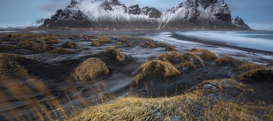
PROBLEM: Uneven Horizon Line
Eleven years ago, I was shooting in Iceland and captured incredible images of the glacier and mountains beneath a beautiful sunset. I used my bubble level. I was stoked.
The problem was that even though the camera was perfectly level, the glaciers were all at pretty intense angles and when I got home later on, the images all felt like they were tilted sharply to the right.
When I straightened them in post processing, they felt better, though the crop was way too tight for most of the compositions that I had so carefully put together. So always look at your images and see if they feel tilted in the camera. You may very well be dealing with an uneven horizon line.
PROBLEM: Not Making the Subject the Focus of the Frame
Many new photographers are afraid to get right in and fill the frame with their subject. Whenever you shoot, you should ask yourself, “what is this image about? What do I like most about where I’m pointing the camera?” Then make the image about that.
Get closer, zoom in. If you’re taking a photo of a bird, the bird should be the main subject of the frame and comprise a majority of the space. Don't be afraid to fill the frame.
PROBLEM: Subject Leaving the Frame
Remember with images that have people or wildlife in them, that the viewers eye is always going to follow the gaze or direction the subject is moving. Place your subjects in a way that they are moving into the frame of the image, or looking inwards to the centre of the shot. This will help your viewer's eye move across the frame as opposed to leaving the frame.
 A lower angle, and having the subject look into the frame helps keep the eye where it needs to be in the composition. Photo by: 'Brian Rueb'.
PROBLEM: The Scene Feels Unbalanced
Try moving around a few feet left and right. See if a slight change in angle will balance the scene better. Get a little lower to make the foreground larger or try getting a little higher for a different perspective.
 This image has a good sense of balance, it also shows how proximity of these three shapes leads to them feeling like they all are part of the same group. Photo by: 'Brian Rueb'.
Oftentimes, an unbalanced scene is easily fixed with just a little movement. If that doesn’t work, sometimes a simple zoom in or out with your lens will eliminate it.
PROBLEM: The Scene is Too Busy
Sometimes there can be so much going on in a scene that it can feel a little chaotic. To fix this, try a different depth of field or use a bokeh for the background. Really focus on your subject and let the rest of the scene blur.
Look at the distracting elements. Can you move them out? Can you change the angle slightly to eliminate or reduce the distractions? The problem might just be that your composition is too wide, so tighten the frame up a little. Ask yourself what is the main subject of this image and have I made the image about that?
PROBLEM: The Depth of Field isn’t Right
If you’re looking at images and all the parts that you want to be sharp simply aren't, then you may have a depth of field issue. To fix this, you'll need to raise your aperture up a little.
Shooting at f/16 or higher is sometimes needed to get a greater depth of field. In extreme cases, you might need to focus stack and blend the images later on in Photoshop.
Make sure too that you're focusing on the correct spot of a frame. For areas where a great depth of field is needed, focus about a third of the way into the frame for a better result. There are apps too that will help you to know where to focus to get the desired depth of field.
On the other hand, if your image has too many areas in focus and those areas are taking away the power of the subject, you might need to lower your aperture a little for a softer background.
PROBLEM: The Subject is Too Centred
First off, just because a subject is centred doesn’t mean that your composition can’t work. It’s just that in a lot of cases, placing your subject in the centre just isn’t as aesthetically pleasing.
Instead, try putting your subject in the upper left of right quadrant, using the rule of thirds overlay that most cameras have built into their view screen. You can now line up the key portions of your subject on those intersection points.
PROBLEM: My Foreground is Boring
An interesting foreground can make or break a composition. Try getting on scene earlier to find the things that will make your foregrounds more interesting, instead of rushing around later on when the lighting is great.
If there is nothing that you can use as your foreground, then it's time to get creative! I know photographers who bring props to shoots. If your fall colour family shoot is lacking in fallen leaves, you can always go gather more and spread them aesthetically throughout the scene.
Also, keep in mind that not all scenes need a foreground, so try simplifying the composition and removing the foreground altogether.
PROBLEM: My Subject Feels Cramped Within the Frame
Back up, or zoom out. Subjects need some room within the frame to “breathe”. Try to keep from placing your subject too close to an edge.
PROBLEM: Camera Settings Keep Bogging Me Down, I Have Trouble Even Getting to Composition
Slow down. Take a deep breath.
First, I would really recommend doing whatever you need to do to learn how your camera works. Learn how the different shooting modes work and how the camera performs in full manual mode. Find out which is better for your style of shooting and the limitations that particular mode may have.
If you’re spending too much time worrying about settings, you’ll never get to composition.
How to Improve Composition in Editing
It's important that you learn to use post-processing tools so that you can make edits to your composition. I like to tell people that no matter how good the image is when you capture it, it’s only about 70% finished. About 25-30% of an image is how it’s processed.
Can people take post-processing too far? Absolutely, but part of your “style” will be how you process images.
There are numerous great tutorials out there you can buy or find online that will give you all kinds of new ways to see your finished images. Remember, the goal is to never process just like the person showing you their workflow. Rather, you should aim to find a few little things from different sources that you can combine with your own editing ideas to help your vision emerge. I’ve been using Photoshop for over 20 years, and I still look for new ways to process files.
Vignette
Adding a vignette around an image can help to pull the eye away from the edges towards the middle of the frame and improve your composition. Be careful though, as too much vignette can be distracting too.
Cropping
Sometimes when I'm in-field, I’ll shoot intentionally a little wider than I should. This gives me room to crop a little when I process. I’m constantly surprised at the little things that I might miss along the edges of a frame, or how badly I didn’t keep the horizon straight. If you’re handholding images, there’s always a better chance you’ll need to do some post-processing image straightening to improve your composition in editing.
Converting an Image to Black and White
Colour images are great but remember that photography was a black and white medium before colour film was on the scene. I’ve taken images in the middle of the day that looked drab and boring in colour, but they had a great tonal range so when I converted them to black and white, they really stood out.
 This image gives a good sense of movement. Black and white helps give it a better mood and accentuates the forms within the scene more. Photo by: 'Brian Rueb'.
Try converting your images to black and white to see if it improves or simplifies your composition. You might be surprised with the results!
Other Ways to Improve Your Composition Skills in Photography
In addition to all of these little tips that I've mentioned above, there are many other ways that you can learn to master the art of composition.
Step 1. Take a Workshop or Hire a Photographer
How many times have you seen a photograph online and thought, “I’ve been there, how did they SEE that shot?”
Photography workshops are great ways to get to amazing locations and have a professional or two on-hand to give you useful tips. Seeing what the other photographers in the group create can also give you some ideas on how to improve your own compositions.
Watch what your instructors shoot and how they work. Taking private classes will ensure that you have more attention to your own photographic process, as opposed to a larger group with more needs and logistics.
Step 2. Look at Other Photos for Inspiration
I think looking at other people's photography is really helpful in improving your own work. I love looking at all types of photography. Oftentimes, photographers in other genres of photography will do things differently, or in a way that I find I can apply to my own work. For instance, a lot of techniques that get used for composition in portrait photography can be translated to wildlife photography and vice versa.
I also like to look at bad photos and try to figure out how I might improve on the composition if I were there taking the shot.
Step 3. Be Patient
Photographers need to realise that composition is the hardest part of photography. Mastering composition is not going to happen overnight. It’s not going to happen after one photography workshop either. It’s a process that develops over time.
Anyone can learn to use camera settings; that’s the easy part. The art form in the medium of photography comes from being able to see images in the field and then having the skillset to take that vision from the field into the computer so that you can finish it.
Step 4. Practice
The more you shoot, the better you’ll get at composition. You need to be out shooting often in order to improve. You’re developing a skill and like any skill, the more you work it, the better your compositions will be. Even when you don’t have a camera with you, you can set up compositions in your head for the way you would shoot it if you did.
Summary
In the end, as challenging as composition may be, it is where the creativity with photography comes in. Any one of us can go to the same location at the same time of day but it’s what we do with the camera that sets us apart.
Now that you've got some background knowledge of compositional concepts, principles and techniques, you can start to look out for these elements while you’re out shooting and apply them to your images. When you look at other photos, try to find these elements of composition within them. See how other photographers utilise them. Successful compositions often contain many of the strategies listed above, used in an harmonious and aesthetically pleasing way.
Mastering composition won’t happen in a weekend; it takes time. So be patient with yourself. Keep looking for inspiration from others and keep an eye trained on how their photos might work compositionally. Most importantly, get out there and start practicing!
About the author: Brian Rueb is a photographer based in the USA. You can find more of his work on his website or by following him on Facebook and Instagram.
Did you find this Ultimate Guide to Composition helpful? What other tips and tricks have you tried for composing in photography? Leave a comment below!